Fatigue chart
The fatigue chart in the SAFE web application is an interactive visual element, which is loaded with information and rich set of controls. It's also the immediately obvious element of the Schedules screen. In this guide we will learn more about the information this chart is showing along with the control set it offers.
Visual elements
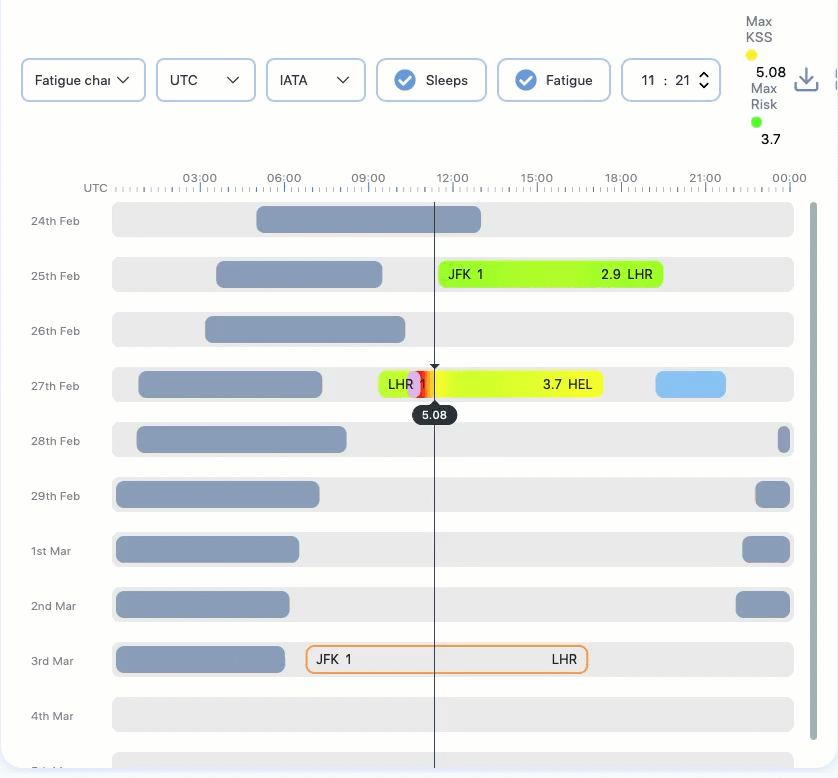
The fatigue chart is scrollable. See below for an image of the fatigue chart and the description of each label (numbered) on it.
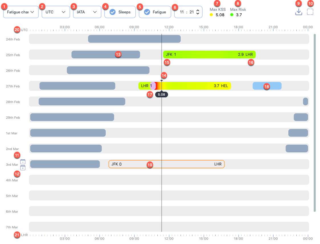
1. Display options
This dropdown shows a choice of display options that you can use to replace the fatigue chart. Click on this dropdown to see the following options:
- Fatigue chart- This is the default option, which shows an interactive fatigue chart.
- Fatigue data - This option lets you view a sequential list of fatigue scores for the all duties in the selected schedule. The scores are shown in 15-minute intervals for the duty periods.
- Risk data - This option lets you view the analysed risk scores for all duties in the selected schedule.
- Sleep data - This option lets you view the a list of calculated and user-defined sleep periods for this schedule.
2. Time scales
This dropdown shows a choice of time zones, which the scale at the top of the fatigue chart should be in. Click on this dropdown to see the following options:
- UTC - This is the default option, which bases the scale at the top of the fatigue chart in UTC.
- Homebase - This option bases the scale at the top of the fatigue chart in home base airport timezone.
3. Airport short codes
This dropdown shows a choice of airport short code format to use for the airport codes displayed in the fatigue chart. You can choose between IATA, ICAO, and FAA formats.
4. Show/hide sleeps
Check this option to show sleep periods in the fatigue chart. To hide sleep periods, uncheck this option.
5. Show/hide fatigue
Check this option to show fatigue information in the fatigue chart. To hide fatigue information, uncheck this option.
6. Seeker time
This option displays the exact time corresponding to the cursor position. The time is based on the 2. Time scales selection.
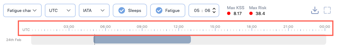
7. Max KSS
This label shows the maximum fatigue score for this schedule based on the scale the administrators have set for this instance. The administrator also set the fatigue threshold for this instance, which is the basis for the coloured circle shown before the score.
The colours move through low (🟢) scores to middling (🟡) scores and finally change into high (🔴) scores. The colour changes are gradual and smooth and don't suddenly change from dark green to dark amber.
If you click on this label, a pop-up screen will appear that provides a score narrative. The narrative is based on the scale set for this instance.
8. Max Risk
This label shows the maximum risk score for this schedule. The administrator also set the risk threshold for this instance, which is the basis for the coloured circle shown before the score.
The colours move through low (🟢) scores to middling (🟡) scores and finally change into high (🔴) scores. The colour changes are gradual and smooth and don't suddenly change from dark green to dark amber.
9. Download chart
This button opens a Download Chart box that lets you download the chart as a JPG or a PDF file. If you opt to download a JPG file for a schedule with months long data, we recommend that you maximise the chart and the browser window before downloading. We also recommend that you crop any unneeded section from the downloaded file to make the information easily scannable.
10. Maximize
This button lets you expand the fatigue chart to fill most of the entire browser window. After you click on the Maximize icon, the icon is replaced by a Minimize icon. Click on the Minimize icon to toggle the chart or report data to the original size.
11. Remove day
Can't remove day with duty
You can't remove a day if a duty starts on that day.
This button appears when you hover your mouse over the left edge of the chart. It lets you remove 24 hours from the all the duties and sleeps starting after the day you intended to remove. To remove a day:
- Click the Remove day () button.
- A confirmation box appears, asking you to confirm your action.
- Click Remove. The fatigue chart will reload, shifting up all the duties and sleep periods after that day by one day.
12. Insert day
This button appears when you hover your mouse over the left edge of the chart. It lets you add 24 hours to the all the duties and sleeps starting after the day where you intended to insert. To insert a day:
- Click the Insert day () button.
- A confirmation box appears, asking you to confirm your action.
- Click Add. The fatigue chart will reload, shifting down all the duties and sleep periods after that day by one day.
13. Model-generated sleep period
Entries in the chart that appear in the darkest shade of the grey indicate sleep periods generated by the model.
14. The cursor
The position of your selection. Notice a horizontal black line from the top to the bottom of the chart. This line is designed to make it easier for you to read the time.
15. Starting airport and information
This label shows the start airport code and the number of sectors flown. The airport code formats can be changed by changing the 3. Airport short codes.
16. Ending airport and information
This label shows the end airport code and the duty risk metric score. The airport code formats can be changed by changing the 3. Airport short codes.
17. Sleep inertia
Such vibrant-coloured sections in a duty entry indicate the transitional state between sleep and wake, marked by impaired performance, reduced vigilance, and a desire to return to sleep. These sections are positioned right after the end of a sleep period.
18. User-defined sleep period
Entries in the chart that appear in a brighter shade of blue indicate sleep periods added by a user for a schedule.
19. Standby duty
This entry indicates standby duty.
20. Top time scale
This time scale can be changed to show the time in UTC or base airport times. See 2. Time scales.
21. Bottom time scale
This time scale can be changed to show the time at the location of duty start airports or duty end airports.
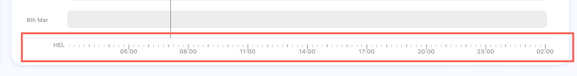
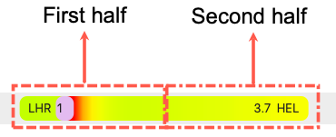
You can select, which airport time to base this scale one by selecting the airport shortcodes in any duty entry. You can also click anywhere on the first half of a duty entry to base the time scale on the duty start airport times. If you click on the later half of a duty entry, the time scale will be based on the duty end airport.
Interactive elements
On top of the visual elements shown above, the fatigue chart also offers interactive controls. Using the fatigue chart, you can:
- Add, edit, copy & paste, or delete a duty
- View duty summary
- Optimise rest
- Manage sleep
- Add and view activities