Schedules
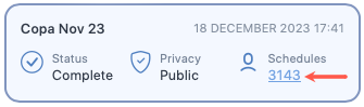
To view the Schedules screen, see View a schedule section in the How to work with rosters guide. In short, you will have to click on the schedule count that appears on a roster card in the Rosters screen to view a schedule.
Schedule screen lets you manage the schedules in the roster you selected. You can create a schedule, edit it or delete it using this screen.
There are multiple ways to upload schedule data to SAFE and CARE models. You can either setup Apps, use SAFE web application, or call the SAFE APIs to upload schedules data into SAFE.
Regardless of the ways you use to upload the schedules, you can view the uploaded schedules and their analysis from this screen. You can search for a specific schedule using the search bar or scrolling through the list of schedules that you will see on next to the menu panel.
After you have opened a schedule, you can access the schedule control bar. This bar lets you perform multiple actions on the schedule, including editing, sharing, commenting, deleting, bookmarking, or even exporting the analysis. You can export the analysis in PDF, Microsoft Excel or CSV formats.
See How to work with schedules to learn more about the actions you can perform on this screen.
Schedule analysis
In an open schedule, you will different analyses for the schedule beneath the schedule control bar. See below for an image of the roster analysis along with the description of each tab (numbered).
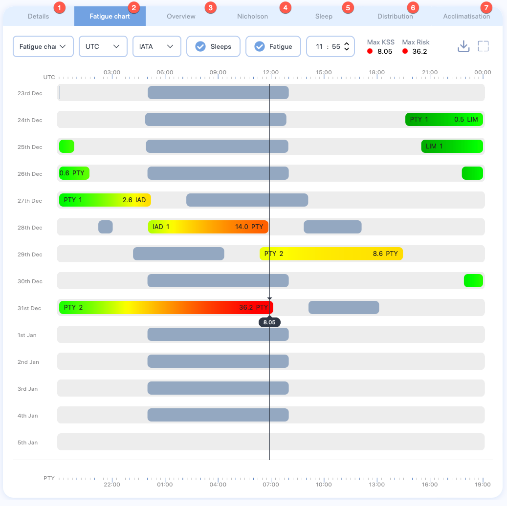
- The Details tab shows details about the schedule, including name, base airport, and maximum fatigue score among others.
- The Fatigue chart tab shows an interactive chart, displaying the fatigue score for this schedule across their duty. See How to work with the fatigue chart to learn more about this chart.
- The Overview chart tab shows a snapshot of rising and falling fatigue scores throughout each duty. See The overview Chart to learn more about the information this chart is showing.
- The Nicholson tab compares the sleep taken within a schedule with work- rate of the schedule. See The Nicholson curve to learn more about the information this chart is showing.
- The Sleep tab compares the rise and fall in the energy level of a schedule in between sleep periods. See The sleep reservoir curve to learn more about the information this chart is showing.
- The Distribution tab shows the cumulative fatigue distribution. Unlike the cumulative fatigue distribution chart in the Rosters screen, this chart doesn't show the fatigue distribution for entire roster; it shows the fatigue distribution for this schedule throughout their duty start and ends times.
- The Acclimatisation tab shows both the position of the pilot’s body clock in relation to the base time zone (blue line) and the position compared to local time (orange line). See The acclimatisation curve to learn more about the information this chart is showing.