The acclimatisation curve
The acclimatisation curve shows both the position of the pilot’s body clock in relation to the base time zone (blue line) and the position compared to local time (orange line). There are two button that can be used to turn off either of the curves to better demonstrate one of them. Also, there is a button next to these buttons to choose either the chart as shown below, or a report displaying the data behind the curve
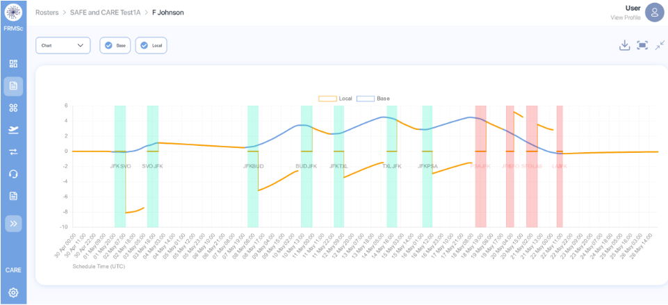
The vertical green bars indicate each duty and those to the right that have turned red indicate fatigue scores above the user defined threshold. The X scale is in hours with eastward movement progressing up the page from the 0 point of acclimatisation to home base. Westward movements push the curve down the page, as indicated in the last days to the right of the schedule above.
The group of icons to the top right indicate a pdf download is available and the screen can be minimised (and maximised) and the curve fitted to the width of the screen.